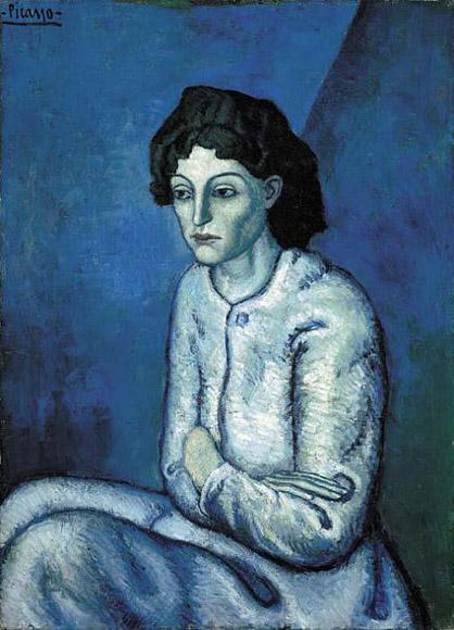
You can’t tell by her expression, but blue is hot, hot, hot. Pablo Picasso’s Woman with Folded Arms. (Credit: PabloPicasso.org)
The hottest color in art over the past 100 years is blue.
That may sound like just one expert’s opinion, but it’s not. It’s the result of a computer analysis of nearly 100,000 celebrated works of art, most created since the year 1800.
A Swedish psychology student and data wiz named Martin Bellanderran the data and published the results on his blog, where theSmithsonian Magazine spotted it and highlighted its conclusions.
“There seems to be a reliable trend of increasingly blue paintings throughout the 20th century!” Bellander writes. “Actually almost all colors seem to increase at the expense of orange.”

A breakdown of most-used colors in the artworks, by year. (Credit: Martin Bellander)
The graphic shows his work. Paintings up to the early 20th Century barely had any blue in them at all. Instead, orange dominated the palette, along with some red and yellow.

A look at just the data since 1800 clearly shows the rise of blue. (Credit: Martin Bellander)
But over the last hundred or so years, blue has been on the upswing. (Green seems to be climbing in popularity, too, but not as much as blue.)
Bellander used online databases of paintings from sites like the BBC,Google Art Project, Wikiart, Wikimedia Commons, and various museums. He details his methodology on his site.


No comments:
Post a Comment