Thursday, April 16, 2015
Wednesday, April 15, 2015
Painting # 58 "Rhododendron"

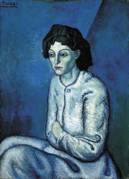
You can’t tell by her expression, but blue is hot, hot, hot. Pablo Picasso’s Woman with Folded Arms. (Credit: PabloPicasso.org)
The hottest color in art over the past 100 years is blue.
That may sound like just one expert’s opinion, but it’s not. It’s the result of a computer analysis of nearly 100,000 celebrated works of art, most created since the year 1800.
A Swedish psychology student and data wiz named Martin Bellanderran the data and published the results on his blog, where theSmithsonian Magazine spotted it and highlighted its conclusions.
“There seems to be a reliable trend of increasingly blue paintings throughout the 20th century!” Bellander writes. “Actually almost all colors seem to increase at the expense of orange.”

A breakdown of most-used colors in the artworks, by year. (Credit: Martin Bellander)
The graphic shows his work. Paintings up to the early 20th Century barely had any blue in them at all. Instead, orange dominated the palette, along with some red and yellow.

A look at just the data since 1800 clearly shows the rise of blue. (Credit: Martin Bellander)
But over the last hundred or so years, blue has been on the upswing. (Green seems to be climbing in popularity, too, but not as much as blue.)
Bellander used online databases of paintings from sites like the BBC,Google Art Project, Wikiart, Wikimedia Commons, and various museums. He details his methodology on his site.
Bellander doesn’t claim to have a definitive explanation for the trend toward more blue. But he discusses four theories offered by his friends and online commenters.
- The aging resins have affected the original colors of the works.
- Changes in price of different pigments.
- It’s just a trend among artists.
- People didn’t have a word for the color blue until relatively recently. (Bellander finds this one the least plausible.)
Blue pigment was scarce and very expensive until relatively recently in human history. The famous 20,000-year-old cave paintings in Lascaux, France, have no blue, noted the New York Times in 2012.
“Early mankind had no access to blue, because blue is not what you call an earth color,” Dr. Heinz Berke, a chemist who studied the history of blue pigment, told the newspaper. That started to change in the 19th century, however.
The availability of blue pigment may help to explain Bellander’s findings, but that doesn’t mean it’s the only reason behind blue’s rise.
“Of course the changes in color might be a results of a combination of factors,” Bellander writes.
He suggests that artistic trends are at least a partial explanation.

Gallery technicians carry Vincent Van Gogh’s ‘L'Allee des Alyscamps’, painted in 1888, past Mark Rothko’s 'Untitled (Yellow and Blue), 1954. (Credit: Getty Images)
“The marked increase of blue at the time of the First World War, might actually reflect a true trend in color use.”
Well...that was an interesting info , but let's get back to my own, painting # 58, which is nothing to do with color blue. I think I will regret about it in a long run, but love for a challenge makes me keep painting high key ....Here is another one ..."Rhododendron"
Well...that was an interesting info , but let's get back to my own, painting # 58, which is nothing to do with color blue. I think I will regret about it in a long run, but love for a challenge makes me keep painting high key ....Here is another one ..."Rhododendron"
Subscribe to:
Comments (Atom)

